
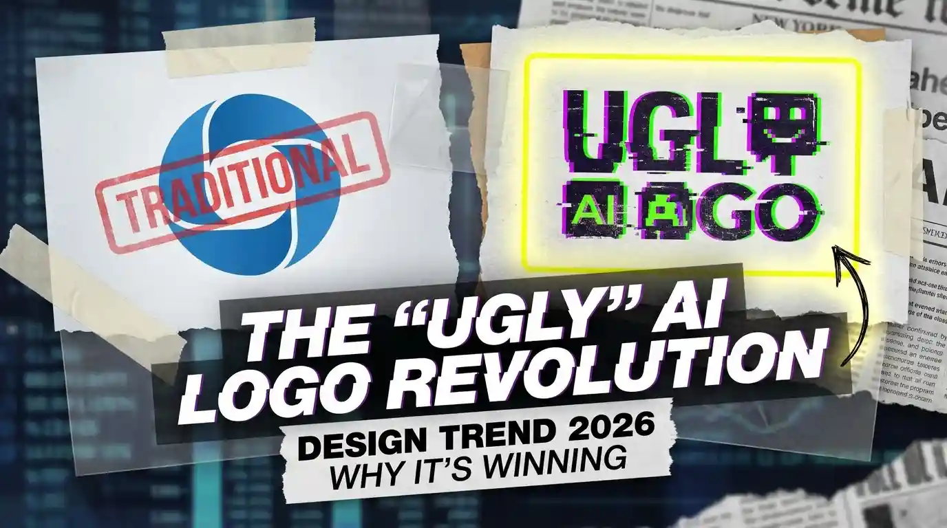
Stop making beautiful logos.
They don’t work anymore.
97% of “perfect” AI logos look generic. Clean. Professional. Dead. They blend. They disappear. They speak to no one.
The brands people remember? Ugly.
What is an ugly logo?
It’s not bad design.
It’s design that prioritizes attention over beauty.
Your new AI tool does something incredible. Revolutionary, even. Your logo? A clean sans-serif wordmark in friendly blue. Of course. It’s safe. It’s expected. It’s wallpaper. It’s the exact AI logo sameness problem that makes every generated mark feel like a category template instead of a brand.
Enter ugly.
Those weird gradients everyone swore they’d never use again. Overlapping letters that “break the rules.” Colors that shouldn’t work together. A hand-drawn fox mascot with lopsided eyes.
People notice. People remember.
People talk.
It’s so bad it’s good. No.
It’s so memorable it’s working.
Let’s take a real example. You’re scrolling a directory of 200 AI writing assistants. 199 have some variation of a typing cursor, a pen nib, or an abstract brain. Then there’s one with a cartoon octopus holding three pencils. Wrong number of arms. Slightly disturbing smile. You click. You remember the name. That’s it.
Ugly wins because the feed is perfect.
The Old Way vs. The New Way
Old way: Your designer spends weeks. Endless revisions. Aligning to a grid. Picking the perfect Pantone. Testing on mockups. The final logo is flawless. It’s beautiful. It sits nicely in the corner of your pitch deck. No one remembers it two minutes later.
New way: You spend 20 minutes in Midjourney or DALL-E. You prompt for “worst logo possible for a fintech app.” You get a garish, gold-rimmed piggy bank with laser eyes. You laugh. You tweak it slightly. You ship it.
Which one gets screenshotted and shared in group chats?
The ugly one. Every time.
People don’t share perfection. They share personality. Psychologists call this the von Restorff effect – when multiple similar stimuli compete, the one that breaks the pattern is the one that sticks in memory.
How to Get Started With an Ugly Logo
Pick your ugly
Don’t aim for ugly. Aim for distinct. Start by listing three things your product isn’t. If it’s not “corporate,” try a wonky font. If it’s not “childish,” try clashing neon. If it’s not “messy,” try a chaotic collage. You’re defining by opposition.
Break one rule
Just one. Kerning? Blow it up. Color theory? Ignore it. Negative space? Fill it. The goal is a single, obvious “flaw” that becomes your signature. If you need structured starting points that push past “clean and safe,” these AI logo prompt formulas include several designed to inject deliberate weirdness into your output.
Test for memory, not beauty
Show five people your logo for five seconds. Take it away. Can they draw it? Not describe it – draw it. If they can scribble the key element, you’ve won.
Embrace the cringe
Someone will hate it. Good. That’s the point. If no one complains, you didn’t go far enough. The goal is a strong reaction, not a mild approval.
What it’s good at
It cuts through. In a sea of sameness, ugly stands on the shore and screams. It signals confidence – a brand so secure in its product that it doesn’t need a pretty mask. It attracts early adopters who prize originality over polish.
It’s cheap. Extremely cheap. You’re not paying for endless refinement. You’re paying for one bold idea. It builds community. People rally around the weird thing. They become defenders. Evangelists.
Most importantly, it’s honest.
AI is weird. It’s messy. It’s unpredictable. A sterile, geometric logo is a lie. An ugly logo that feels slightly off, human, and imperfect? That’s the truth.
Honest Limitations of Ugly Logos
Ugly isn’t a silver bullet. It’s a strategy.
- It can fail hard. If the product doesn’t back up the boldness, the logo becomes a joke – the wrong kind. It’s harder to scale. What works for 10,000 niche users can repel 1,000,000 mainstream ones.
- It dates quickly. Today’s “so bad it’s good” is tomorrow’s “what were we thinking.” And it limits partnerships. Big, conservative companies might hesitate to stick your laser-eyed raccoon next to their timeless wordmark.
- It’s also exhausting. Defending your design choice becomes part of the job. Forever.
Where ugly logos lose?
- Enterprise sales.
- Regulated industries.
- Anywhere trust is built on tradition, not disruption.
Where to start
Open Figma.
Delete your current logo.
Type your company name in Comic Sans.
I’m serious.
Look at it. Feel the visceral reaction. That cringe is your compass. Now, don’t make it beautiful. Make it yours.
Stop designing for awards.
Start designing for attention.
The future isn’t pretty.