Creating scroll-stopping visuals that look sharp on every network can feel like playing whack-a-mole with constantly shifting size guidelines,-mode palettes, and ever-smaller phone screens.
But with a handful of practical rules—and a few designer tricks—you can build one master graphic that adapts gracefully to Instagram, Facebook, X (Twitter), LinkedIn, TikTok, and wherever your audience hangs out.
Below is a step-by-step, human-friendly guide written for busy social media managers, freelance designers, small-business owners, and anyone else who wants to make their brand look brilliant without burning hours in Photoshop.
Why Adaptive Graphics Matter
A single photo that looks crisp on LinkedIn may show up pixelated or awkwardly cropped on Instagram Stories.
Each network has its own optimal pixel dimensions, aspect ratios, and compression rules, so posting one “one-size-fits-all” image inevitably hurts reach and engagement.
Adaptive graphics are designs that begin with a high-resolution master file and are then resized or re-positioned for each platform, ensuring that text, logos, and faces stay readable while file sizes stay fast-loading.
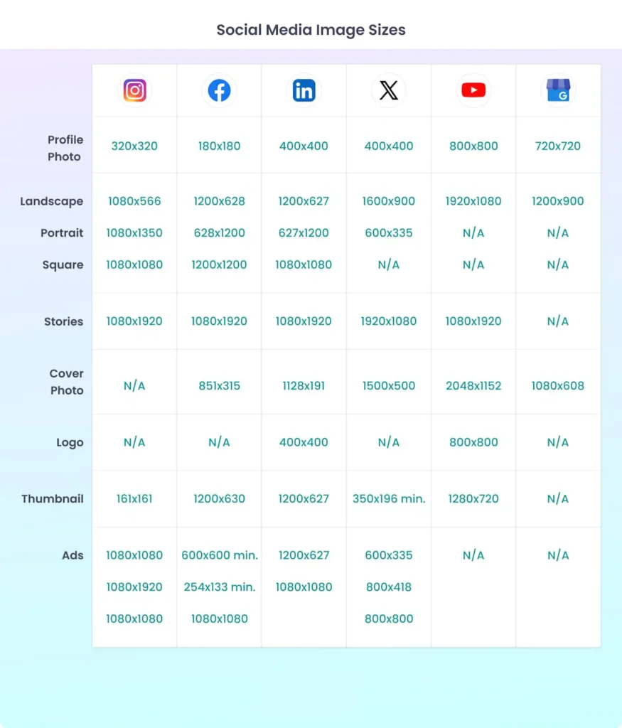
Infographic showing recommended image sizes for Instagram, Facebook, LinkedIn, X, YouTube, and Google Business Profile across various image types for 2025.
Also Read : 50+ AI Logo Prompt Formulas: Industry‑Specific AI Logo Design Prompts
Step 1: Start With the Right Dimensions
Open your design tool of choice (Adobe Illustrator, Canva, Figma—pick your poison) and create a square art board at 1080 × 1080 px.
Square is the easiest starting point because it adapts smoothly to LinkedIn feed images (1200 × 1200 px), Facebook posts (1080 × 1080 px), and Instagram’s classic grid.
Keep your resolution at 72 dpi for web and export PNGs when your graphic contains text or vector shapes to avoid the fuzzy JPG compression many platforms apply.
Pro tip: Name your layers—especially the logo, headline, and background—so you can selectively hide or move them when building platform-specific versions later.
Step 2: Keep Key Elements in the Safe Zone
Every major platform crops profile photos into circles and overlays UI chrome (like buttons, captions, and usernames) around the edges of Stories, Reels, and Shorts.
That makes “safe zones” non-negotiable. Center important elements inside the middle 80% of your canvas, and leave at least 130 px padding at the bottom for Instagram Reels captions. Adobe Express and Canva both include safe-zone overlays, or you can manually drag guides.

Step 3: Choose the Right Format—Vector vs. Raster
Logos, icons, and text overlays should be designed as vector objects so they stay razor-sharp whether shrunk to a 400 × 400 px Twitter avatar or blown up for a LinkedIn banner.
Photos, gradients, and complex artwork belong in raster layers. Mixing both lets you export a lossless SVG for print and lightweight PNGs or JPGs for the web without redrawing from scratch.

Step 4: Nail Color Consistency—Even in Dark Mode
With roughly 82% of Android and iOS users preferring dark mode at least part of the day, your graphics must work on both bright and charcoal interfaces.
Use a limited palette of three to five brand colors and test against #FFFFFF and #121212 backgrounds. Avoid ultra-saturated hues—they vibrate on dark surfaces and often fail WCAG AA contrast. Instead, pick slightly muted tints and add a single high-contrast accent for calls to action.
Step 5: Export Smart, Not Hard
Instead of saving six completely different files, export four core variants:
- Square Master – 1080 × 1080 px (Facebook, LinkedIn, Instagram feed)
- Vertical Story/Reel – 1080 × 1920 px with 250 px text-free top and bottom
- Horizontal Banner – 1500 × 500 px (X header) or 851 × 315 px (Facebook cover)
- Profile Thumb – 400 × 400 px (X and LinkedIn) or 320 × 320 px (Instagram)
Most design apps let you batch-export these sizes with one click once your adaptive layers are set.
Step 6: Test on Real Devices
Nothing kills a perfectly crafted design faster than unexpected compression. Before publishing, airdrop or email the exported files to your phone, open them in each native app, and preview in both light and dark themes. Watch for fuzzy text, color-banding, and hidden edges. Make quick tweaks, re-export, and you’re set—no guessing.
Step 7: Automate the Boring Stuff
If you’re juggling dozens of profiles, consider bulk-resizing tools like Canva’s Magic Resize, Buffer’s Pablo, or Photoshop’s Export > Generate. These automate repetitive crops while preserving smart objects, letting you spend time on creative flourishes instead of pixel math.
Final Thoughts
Adaptive graphics aren’t rocket science—they’re a workflow. Start with a high-resolution square, respect safe zones, build with vector smartness, pick contrast-strong colors, and export a tidy set of platform presets.
Do that consistently, and your brand will look polished across every feed, story, reel, and banner—no matter how many new sizes the networks dream up next year.
Your followers will notice, algorithms will reward the clarity, and you’ll reclaim hours of design time—leaving more room for what really matters: telling stories that connect. Happy designing!

Leave a Comment