Quick Answer:
Your AI favicon looks blurry because it has too much detail for a 16×16 pixel grid. Browsers aggressively downscale complex AI images, turning gradients and fine lines into “mud.” To fix it, you must crop to a single element and increase contrast before resizing.
You designed a stunning logo in Midjourney. It looks incredible at full size. But the moment you upload it as your site’s Favicon (the tiny icon in the browser tab), it turns into a fuzzy, pixelated smudge.
You aren’t alone. This is the #1 issue with AI-generated logos.
Unlike traditional vector logos, AI images are usually “Raster” (pixels) and heavily detailed. When you cram a 1024px image into a 16px space, the browser has to delete 98% of the information.
Here is the science behind the blur and the 3-step workflow to get a crisp, professional icon.
Reason 1: The “Downscaling Disaster”
Browsers usually display favicons at 16×16 pixels.
If your AI logo has thin lines, subtle shadows, or text, those pixels physically cannot exist in a 16×16 grid. The computer tries to blend them together, resulting in a blurry grey mess.
The Rule of Thumb: If you can’t recognize your logo when you squint your eyes from across the room, it will fail as a favicon.
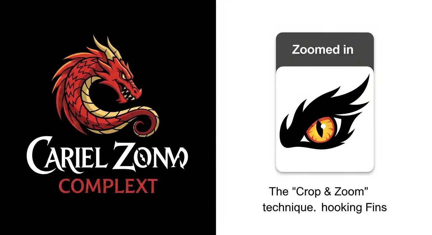
Step 1: The “Crop & Zoom” Fix (Do This First)
Do not just upload your full logo. You must create a specific “Favicon Variation.”
- Identify the Strongest Element: Pick the most distinct part of your logo (e.g., the first letter, a specific symbol, or a mascot’s eye).
- Crop Tight: Use a free tool (like Canva or Paint) to crop only that element.
- Remove Text: Never put your full company name in a favicon. It will be unreadable lines.
Example: If your logo is a “Wizard holding a staff with the text MagicAI,” your favicon should just be the tip of the staff or the wizard’s hat.
Step 2: Increase Contrast & Saturation
At 16 pixels, “subtle” doesn’t exist. Colors wash out.
Before resizing, open your cropped image and:
- Boost Saturation: Make the colors 20% brighter.
- Boost Contrast: Make the darks darker and lights lighter.
- Remove Shadows: Drop shadows look like dirt at small sizes. Delete them.
Step 3: Generate the Correct Files (ICO vs PNG)
Don’t just upload one file. Modern browsers need different sizes for different devices. If you only provide one size, the browser will stretch it (blur) or shrink it (blur).
Use a free generator (like RealFaviconGenerator.net) to create these three essential files:
| Size | Usage | Format |
| 16×16 | Desktop Browser Tabs | .ico or .png |
| 32×32 | Retina Screens / Taskbars | .png |
| 180×180 | iPhone/iPad Home Screen | .png (Apple Touch Icon) |
| 192×192 | Android Chrome | .png |
Pro-Tip: The “Dark Mode” Check
Most people browse in Dark Mode now. If your favicon is a black shape with a transparent background, it will disappear on a dark browser tab.
The Fix: Add a thin white outline (stroke) around your icon, or put it inside a solid colored circle/square container. This ensures it pops on both white and black screens.
Conclusion
A blurry favicon makes your website look broken/untrustworthy. By creating a simplified, high-contrast version of your AI logo specifically for the browser tab, you ensure your brand looks sharp on every device.
If your main logo is still a square and you need a more flexible layout for headers or navigation bars, you can also convert your square logo to a horizontal version to keep your branding consistent across all touchpoints.


Leave a Comment