Walk through any mall or scroll through Instagram, and you’ll spot them everywhere—those little leaf symbols on polo shirts, workout gear, and designer labels.
Some are simple and modern. Others look like they belong on ancient Greek pottery. But they’re all telling you something.
Fashion logos don’t just identify brands. They whisper stories about who you could become if you wore them. And the leaf? It’s been whispering for thousands of years.
From Fred Perry’s laurel wreath to the maple leaf on Canadian gear, nature symbols dominate fashion branding. This isn’t random. There’s psychology, cultural baggage, and cold hard strategy behind every leaf you see stitched onto fabric.
Let’s dig into why fashion brands can’t stop using leaves in their logos.
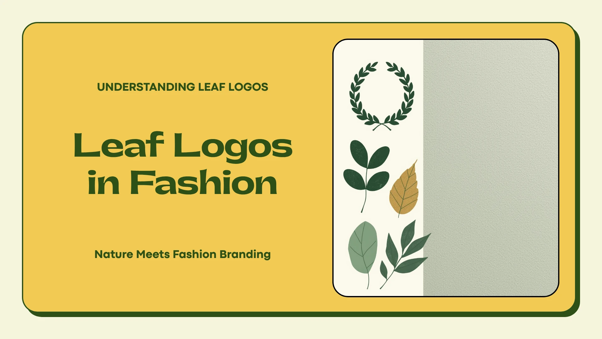
The Deep Roots of Leaf Symbolism
Leaves mean life. That’s the short version.
Every culture on earth connects leaves with growth, renewal, and the cycle of seasons. When spring arrives and trees explode with green, we feel hopeful.
When autumn leaves turn gold and fall, we think about change and beauty in endings. Fashion brands borrow these feelings when they slap a leaf on their logo.
But it goes deeper than “nature = good.”
In ancient Greece and Rome, they crowned winners with laurel wreaths. Athletes, poets, military heroes—all got the leaves.
That tradition stamped “victory” into our cultural DNA. Now when you see a laurel wreath on a shirt, your brain registers “champion” without you even thinking about it.
Eastern philosophy adds another layer. In Japan, maple leaves (called momiji) represent time passing and life’s fleeting beauty. That’s way more poetic than just “hey, nice tree.” Chinese culture sees certain leaves as symbols of persistence and harmony with nature.
Then modern environmentalism showed up and turned every leaf into a billboard for sustainability. Fair or not, green leaves now scream “eco-friendly” whether the brand actually gives a damn about the planet or not.
Why Fashion Brands Specifically Choose Leaf Logos
Fashion operates in weird territory. You’re not just buying fabric—you’re buying an identity, a tribe, a version of yourself.
That makes logo choice critical. And leaves offer something most symbols can’t: they work everywhere.
They never go out of style. Leaves have been cool for 3,000 years. Try that with a trendy geometric pattern from 2019. Heritage brands love this because they’re selling timelessness, not just clothes.
They translate across cultures. Sure, maple leaves scream “Canada” and oak leaves feel British. But the general concept of “leaf = positive natural thing” works from Tokyo to Toronto to São Paulo. That matters when you’re trying to sell globally.
Subcultures can hijack them. This one’s fascinating. Fred Perry’s laurel wreath started on tennis courts in the 1950s. Then mods grabbed it. Then skinheads. Then punk kids. Then indie bands. Each group poured their own meaning into the same simple symbol. The brand didn’t change—the context did.
That flexibility is gold for fashion companies. One logo, multiple meanings, diverse customers.
The Psychology Behind Nature Symbols in Fashion Branding
Your brain likes leaves even when you don’t realize it.
Studies show that looking at nature imagery—including simple things like leaf shapes—reduces stress and makes you feel better. It’s called biophilic design, and it’s hardwired into humans from evolution. We spent millions of years in forests and grasslands. Our brains recognize natural forms as safe and good.
Fashion brands weaponize this. That leaf logo triggers a tiny positive feeling before you even check the price tag or fabric quality.
There’s also the trust factor. In a world of plastic everything and clothes made by robots, natural symbols signal authenticity. Your brain sees a leaf and thinks “real, trustworthy, honest.” Even if it’s complete bullshit and the brand’s factory dumps chemicals in a river somewhere.
This gets into darker territory with greenwashing—brands using nature symbols while their actual practices are environmental disasters. Consumers are getting wise to this trick, but the psychological pull of leaf logos remains strong.
Social identity plays a role too. When you wear a brand with a recognizable leaf logo, you’re signaling membership in a tribe. Fred Perry wearers know other Fred Perry wearers. It’s a visual handshake that says “we’re the same kind of person.”
According to research in environmental psychology published by ScienceDirect, natural elements in design increase both attention and memory retention. For brands fighting for shelf space and scroll-stopping power, that’s a massive advantage.
From Tennis Courts to Street Style: The Laurel Wreath Journey
Fred Perry’s laurel wreath deserves its own section because the story is wild.
Tennis champion Fred Perry launched his clothing line in 1952 and stuck a laurel wreath on it—basically saying “I won Wimbledon and you didn’t.” It was a flex. An elegant one, but still a flex.
Then British mod kids in the 1960s adopted Fred Perry polos as their uniform. Clean lines, sharp look, working-class pride. The laurel wreath became a badge of modernist style.
Skinheads came next—originally a multiracial working-class subculture before getting hijacked by racists later. They loved Fred Perry too. Then punks wore it ironically. Then Britpop bands in the 90s. Then indie kids. Then it circled back to being preppy again.
Same logo. Completely different meanings depending on who wore it and when.
That’s the magic and danger of symbolic branding. You don’t fully control what your logo means once it’s out in the world. Fred Perry has spent decades managing the cultural associations of their laurel wreath, sometimes embracing certain groups and actively rejecting others.
For a detailed look at various brands using leaf symbols, including Fred Perry’s evolution, check out this comprehensive guide to clothing brands with leaf logos.
The Maple Leaf: National Identity Meets Fashion
If laurel wreaths mean victory, maple leaves mean Canada. Full stop.
Canadian brands like Roots built entire identities around that red maple leaf. It’s not subtle—it’s screaming “WE’RE CANADIAN AND PROUD.” But it works because the maple leaf carries specific positive associations: friendly, outdoorsy, ethical, quality-made.
Compare that to slapping an American flag on clothing. Totally different vibe. Flags can feel aggressive or political. The maple leaf somehow stays softer, more inclusive. It suggests belonging without the intensity.
International brands sometimes use maple leaf elements to signal Canadian manufacturing or to borrow those positive associations. “Made in Canada” implies environmental consciousness and ethical labor practices, whether or not that’s actually true for any specific company.
Sports brands and outdoor gear companies especially love maple leaf logos. Canada’s geography—mountains, forests, endless winter—makes the connection feel natural. The leaf says “we understand cold weather and outdoor life” without needing words.
Sustainability and the Modern Leaf Logo
Everything changed when environmental consciousness hit mainstream.
Now every leaf logo carries an implied promise about sustainability, whether the brand intended that or not. Modern companies launching today often choose minimalist single-leaf designs specifically to telegraph eco-values.
These aren’t ornate Victorian botanical illustrations. They’re stripped-down, geometric, pure. The aesthetic itself communicates “we’re honest, transparent, back-to-basics.”
This creates a minefield. Genuinely sustainable brands benefit—their leaf logos reinforce authentic practices using organic materials, ethical factories, and transparent supply chains. But it also enabled massive greenwashing.
Slap a leaf on your logo, talk about “natural inspiration,” and suddenly consumers think you care about the planet. Even if your clothes are made from petroleum-based synthetic fabrics in factories with horrific conditions.
People are catching on. Organizations like Fashion Revolution push for transparency and call out brands using environmental imagery without substance. A leaf logo now comes with expectations. It’s a promise you’d better keep.
Interestingly, some heritage brands with existing leaf logos have retrofitted sustainability narratives onto symbols originally chosen for totally different reasons. The leaf’s meaning evolved to match cultural shifts. That flexibility keeps old brands relevant as values change.
The Athletic Wear Revolution: Leaves in Motion
Athletic wear exploded from gym-only to everyday fashion, and leaf logos came along for the ride.
In sports contexts, leaves mean vitality, peak performance, and human potential. It’s less about nature conservation and more about your body operating at its natural best. The leaf becomes a metaphor for athletic achievement.
Adidas Trefoil nails this. Three stylized leaves representing continental expansion in the 1970s became a streetwear icon. Now it signals both athletic credibility and urban style. That crossover—from functional sportswear to fashion statement—is where the money lives.
Budget activewear brands jumped on leaf logos too. Simple, modern leaf designs let them compete visually with established names without the heritage or price tag. The leaf democratizes performance—suggesting everyone deserves quality athletic wear, not just people who can afford premium brands.
The outdoor-athletic fusion trend created another angle. Brands blending hiking influences with city style use leaf symbols to bridge wilderness and urban contexts. The leaf says “I could summit a mountain but I’m just buying coffee right now.”
Design Considerations: How Fashion Brands Render Leaf Logos
Choosing a leaf is step one. Designing it well is where brands live or die.
Detailed vs. Minimal: Heritage brands go intricate. Every vein in the leaf, realistic shading, craftsmanship visible in the logo itself. Contemporary brands go geometric and simple—shapes that read instantly on a phone screen or from across a room.
Color Strategy: Green seems obvious, but fashion brands use every color. Black and navy for classic sophistication. Burgundy for heritage luxury. Bright neon for youth-focused activewear. The color choice completely changes the leaf’s meaning.
Leaf Species: Laurel wreaths signal classical victory. Maple leaves say Canada or autumn. Oak leaves suggest strength. Generic leaf shapes work when you want nature vibes without cultural baggage. Each choice is strategic.
Typography Integration: The best fashion logos make leaves and text work together seamlessly. Some replace letter dots with leaves. Others crown wordmarks like a wreath. A few integrate leaves into the actual letter shapes. This integration elevates the design from “logo with a leaf added” to “cohesive identity system.”
Scalability: Fashion logos need to work embroidered tiny on a shirt label and blown up huge on a billboard. The winners balance detail with simplicity—distinctive enough to be recognizable, simple enough to remain clear at any size.
Cultural Sensitivity in Leaf Symbolism
Here’s where brands screw up if they’re not careful.
That “neutral nature symbol” might be sacred to Indigenous peoples in certain regions. Or carry specific cultural meanings you’re completely ignorant about. Fashion brands going global need to research whether their leaf choice accidentally disrespects someone’s cultural heritage.
The maple leaf means different things in Canadian vs. Japanese contexts. Cannabis leaves remain controversial despite legalization in many places—some brands walk that line carefully with stylized designs that wink at cannabis culture without explicitly depicting it.
Cross-cultural design research shows symbols rarely mean the same thing everywhere. A leaf logo that crushes it in North America might accidentally communicate something negative in Asian markets. According to design experts at the Design Management Institute, this homework is non-negotiable for international brands.
The stakes are high. Get it wrong and you’re dealing with boycotts, social media backlash, and genuine harm to communities whose symbols you appropriated without permission or understanding.
The Future of Leaf Logos in Fashion
Fashion evolves but certain symbols stick around. Leaves aren’t going anywhere—they’re just changing how they show up.
Digital-first design means future leaf logos will be more geometric, higher contrast, and animation-ready. Static images become dynamic—leaves that grow, change color, or respond to user interaction in AR experiences.
Hyper-specific botanical accuracy might replace vague “leaf = nature” symbolism. Brands showing exactly which plant their materials come from—cotton leaves for cotton shirts, flax for linen. This transparency builds trust with increasingly skeptical consumers.
AR integration is coming fast. Point your phone at a leaf logo and watch the plant grow, see the garment’s supply chain, view environmental impact data. The leaf becomes a portal to deeper brand stories.
Blockchain verification could embed invisible cryptographic elements in leaf logos—proving authenticity and fighting counterfeits while maintaining visual simplicity.
Fashion brands that succeed with leaf logos going forward will be those whose symbols represent genuine commitments, not empty decoration. The leaf makes a promise. You’d better keep it.
The Enduring Power of the Leaf
Fashion operates where commerce meets culture meets psychology. In that messy intersection, the simple leaf thrives.
From ancient victory wreaths to modern sustainability statements, leaves adapt while keeping their core associations with life, growth, and nature. They work commercially. They resonate psychologically. They provide visual flexibility across every fashion category from luxury to budget activewear.
But here’s the thing: consumer expectations are rising. A leaf logo now carries weight. It implies promises about quality, values, environmental practices, and ethical production. Brands that slap on leaf symbols without backing them up with substance will get called out.
The most successful fashion brands using leaf logos will be those whose symbols reflect genuine commitments. Heritage brands honoring their history. Sustainable brands proving their practices. Athletic brands delivering performance. The leaf itself isn’t enough—it needs meaning underneath.
Next time you see a leaf stitched onto a shirt or printed on a tag, remember: you’re looking at a symbol with thousands of years of cultural weight, multiple layers of meaning, and a future that keeps evolving. That delicate natural form carries more power than its simple shape suggests.
It’s one of fashion’s oldest tricks, and it’s still working.

Leave a Comment