On March 28, 2023, Pepsi introduced a new look to celebrate its 125th anniversary. The design features a centered logo, a vibrant blue color, new black accents, and a signature “pulse” that connects the past with the present.
The update, which hit U.S. stores on August 23, 2023, was described as a blend of tradition and modern style. But it sparked a common question: why does this well-known brand change its logo so often?
Mauro Porcini, PepsiCo’s Chief Design Officer, explained, “We created this new identity to connect future generations with our brand’s history. It combines our past with modern elements — a fresh typeface, vibrant blue with black from Pepsi Zero Sugar, and a logo that adds movement and energy.”
This shows the importance of design, color choice, and using the globe as a symbol.
Strategic Business Rationale
Pepsi’s redesign isn’t just about looks. Leaders linked it to a focus on products like Pepsi Zero Sugar, a digital-first approach, and a consistent global brand image.
Todd Kaplan, Pepsi’s CMO, said, “This new and modern look will help us stand out and encourage people to enjoy life without holding back.”
The black accents highlight the zero-sugar aspect, while the pulse and can shape are made for social media and retail experiences.
Brand Origins & Early History
Pepsi started as “Brad’s Drink” in 1893 and became Pepsi-Cola by 1898. Its early logos were fancy red scripts reflecting the styles of that time.
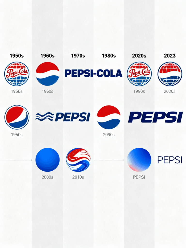
In the 1940s, Pepsi introduced a patriotic red, white, and blue bottle cap. This design created the circular “globe” logo, which has been reimagined many times since.
5. Decade-by-Decade Evolution

1950s–19600s: From Cap to Flat Globe
By the 1950s, Pepsi switched from fancy lettering to a simpler bottle cap design. In 1962, the cap became flat, and the logo changed to bold, easy-to-read letters. This fit the modern designs of the mid-20th century and the needs of TV ads.
1970s: Simplification and the Globe
In 1973, Pepsi turned the cap into a simple disc, the early form of the “globe.” They made it less detailed to appeal to international markets. The logo was often centered in the disc, embracing a minimalist style as they expanded globally.
1980s–1990s: Bold, Energetic, Three-Dimensional
From the late 1980s to the 1990s, Pepsi played with the logo’s placement. By 1991, the font was above the globe. In 1997, the globe turned metallic and 3D as part of the “Project Blue” design, reflecting the vibrant youth culture of that time.
2000s: Digital Polish and the Smile
The updates in 2003 and 2008 improved the visibility of the globe, while the 2008 redesign introduced an uneven “smile” and unique shapes. This design stirred up plenty of discussion.
2010s–Present: Flexible Systems For Digital Life
In the 2010s, Pepsi made their designs simpler and more consistent across products. The 2023 redesign brought the word and globe back together, added bright blue and black colors, and included motion elements for use in social media, stores, and the metaverse.
The Controversial Rebranding
The 2008 redesign by the Arnell Group became famous for two reasons: the unusual Globe design and the leaked detailed design strategy. This strategy sounded more like a marketing pitch than real design insight.
Critics found it pretentious, and many made fun of, comparing the logo’s geometry to the genius of the “Mona Lisa.”
In the end, the costly redesign didn’t win people over; instead, it led to more eye-rolls. This case perfectly illustrates why logos are expensive — when agencies overinvest in theoretical complexity without delivering clear value, even million-dollar budgets can’t guarantee success.”
It showed brands that confusing explanations don’t connect with customers.
Current Logo & Design Philosophy
The new logo features the word “Pepsi” inside a modernized Globe, trading the classic royal blue for a bright electric blue and adding black to highlight Pepsi Zero Sugar.
The idea is to blend elements from the past (like the centered word and the stripe) while creating a flexible, animated identity for digital storytelling. It’s about using nostalgia in a fresh way for screens and stores.
Public Reception
Reactions to the new design have been mixed. Some design critics appreciated the nod to history, while social media users were divided — some said it seemed “finally normal,” while others questioned the need for change. Trade articles described it as smart marketing aimed at zero-sugar products and Gen Z nostalgia.
In summary, marketers praised the strategy, while some consumers viewed the update as just another step in Pepsi’s long visual journey.
Key Takeaways: 4 Actionable Lessons
1. Listen to what people actually draw from memory
Brands: Test Simple Recall. Pepsi’s 2023 team saw that many people remember the globe from 1987 to 1997. Instead of fighting this, they embraced it.
This is nostalgia backed by research: Use simple memory tests and quick surveys to find out what visuals your audience remembers.
For Your Brand: Run quick recall tests before changing important features.
2. Tie visual moves to business strategy, not ego
Any new color or font should enhance your product or brand image (like Pepsi’s black accents for Zero Sugar or the can design for better store visibility).
If your design doesn’t connect to sales, distribution, or strategy, it’s just decoration. Map each visual change to a clear business result (like search success or sales goals).
3. Balance heritage with functional modernization
Heritage Builds Trust, Modernization Builds Relevance. Pepsi kept the globe but simplified it and added animation for digital platforms.
For Smaller Brands: Keep one recognizable feature (like shape, color, or tagline) while updating for modern media. This helps maintain recognition while showing progress.
4. Avoid opaque, pretentious rationales
The BREATHTAKING episode reminds us that overthinking with complex theories can invite mockery and distract from usability.
Keep Your Design Brief Clear: Focus on user needs, context, limitations, and measurable objectives. If you use design theory, show how it translates into real outcomes (like readability and visibility).
Conclusion
Pepsi’s history of over eleven logo changes in 125 years is a lesson in balancing consistency with innovation.
Each update reflects changing cultures (like patriotism, modernity, and digital trends) and business needs (like packaging and connecting with the youth).
The 2023 redesign highlights a key point: successful branding combines recognizable heritage with designs suited for screens, stores, and culture.
However, mistakes and memes remind us that strategy should always be clear and accountable.
In the end, Pepsi’s logo journey shows that strong brands continue to listen, test, and adapt. Expect more changes; that’s how global icons stay relevant.


Leave a Comment