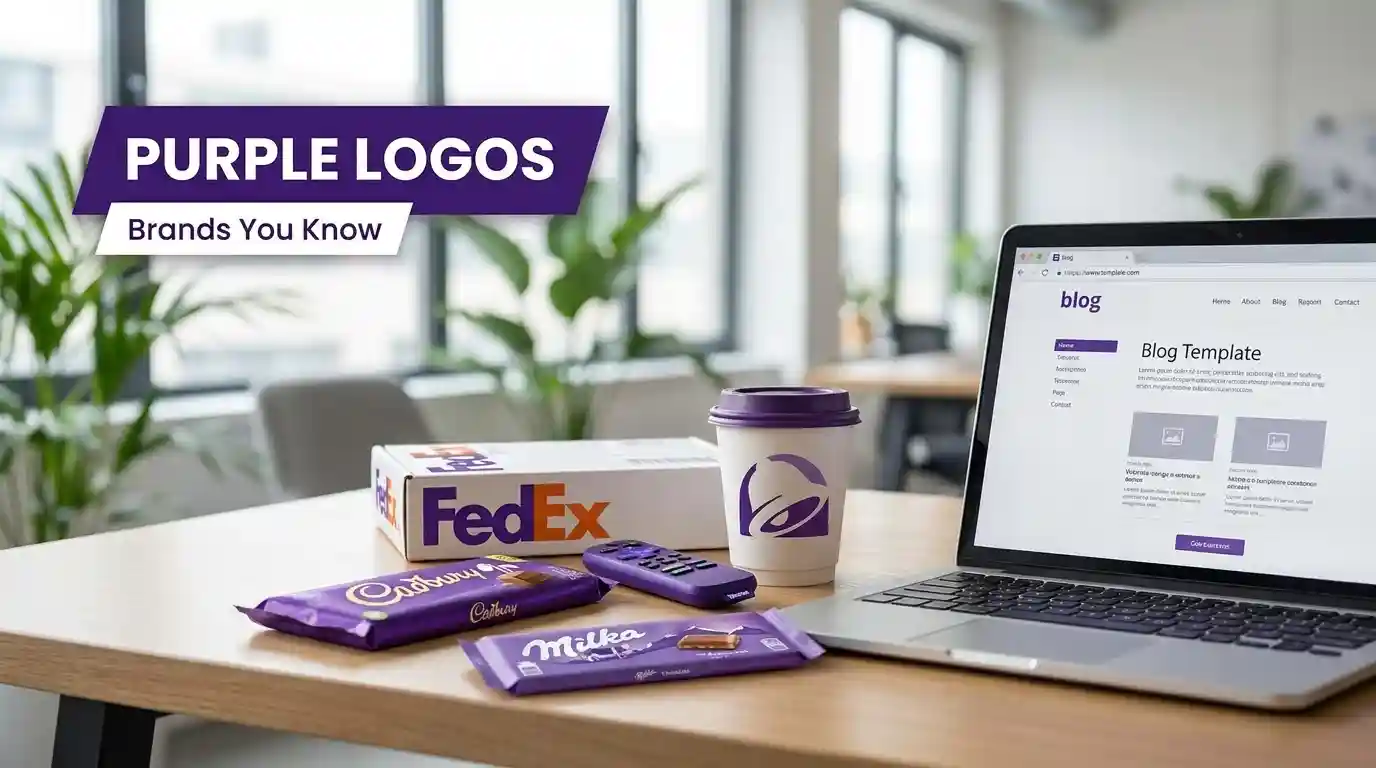
Think purple is too bold for a brand logo? Tell that to Cadbury, FedEx, and Yahoo. Some of the most famous companies with purple logos have built billion-dollar identities around this single, powerful color – and it’s no accident.
Purple sits at a rare intersection in color psychology. It signals luxury, mystery, creativity, and authority all at once. That’s a lot of heavy lifting for one hue.
And when the right brand wears it well, purple becomes instantly recognizable – the kind of color that makes you reach for a chocolate bar before you’ve even read the name.
Let’s look at the brands that have made purple their signature – and why it works so brilliantly for each of them.
Why Do Brands Choose Purple?
Before diving into the list, it helps to understand the color theory behind the choice. Purple is a secondary color, born from mixing red and blue – passion and calm, blended into one.
Historically, it’s been the color of royalty, religious ceremony, and honor. Across cultures, it carries weight.
For brands, purple communicates luxury, sophistication, and boldness. It stands apart from the sea of corporate navy blues and aggressive reds. It’s distinctive without being alarming. That’s exactly why so many famous companies have leaned into it – sometimes as a primary brand color, sometimes as a powerful accent.
This is why color selection is never a random decision. If you’re building your own brand identity, understanding how color psychology shapes perception in logo design can make the difference between a logo that blends in and one that gets remembered for decades.
Famous Companies With Purple Logos
Cadbury
Few logos are as iconic as Cadbury’s deep royal purple. The British chocolate giant has used this shade for over a century, and it works perfectly – purple whispers indulgence, luxury, and sensory pleasure before you’ve even unwrapped the bar. It’s a masterclass in color branding.
Yahoo

Yahoo is one of the most globally recognized companies with a purple logo. The bright, saturated purple was chosen to communicate boldness, excitement, and a hint of mystery — qualities that felt perfectly suited to the early, wide-open energy of the internet. Even through multiple logo redesigns, Yahoo never abandoned its purple identity.
FedEx

At first glance, FedEx looks more like a blue-and-orange company. But look closely — FedEx Ground uses purple prominently, and it’s more than a stylistic choice. Purple adds a layer of dependability and prestige to the brand, reinforcing the promise that your package is in trusted, premium hands.
Hallmark

Hallmark’s purple and gold combination is unmistakable on any greeting card shelf. The purple background evokes sentimentality, nostalgia, and heartfelt emotion — exactly what you want to feel when you’re picking a birthday card for your mum. It’s a branding decision that has aged beautifully over decades.
Cadbury’s Close Cousin: Milka

Milka, the beloved European chocolate brand under Kraft, wraps everything in lavender purple. The soft, lighter shade feels alpine, trustworthy, and distinctly gentle — which pairs perfectly with their whole “tenderness” brand identity. Milka is proof that the shade of purple matters just as much as the color itself.
Taco Bell
Yes, a fast food brand chose purple — and it paid off. Taco Bell uses purple to carve out a unique space in a category dominated by red and yellow. The color gives them a quirky, bold personality that says: we’re not your average burger joint. It works because it’s unexpected.
LA Lakers
In sports branding, purple and gold is almost sacred. The LA Lakers have made this color combination one of the most recognizable in professional basketball. Purple here projects royalty and confidence — fitting for a team with one of the most decorated histories in the NBA.
Syfy Channel
As a science fiction television network, Syfy leaned into purple’s associations with mystery, the unknown, and the otherworldly. The color choice is essentially a visual promise to viewers: expect the strange, the dark, and the wonderfully weird.
Baltimore Ravens
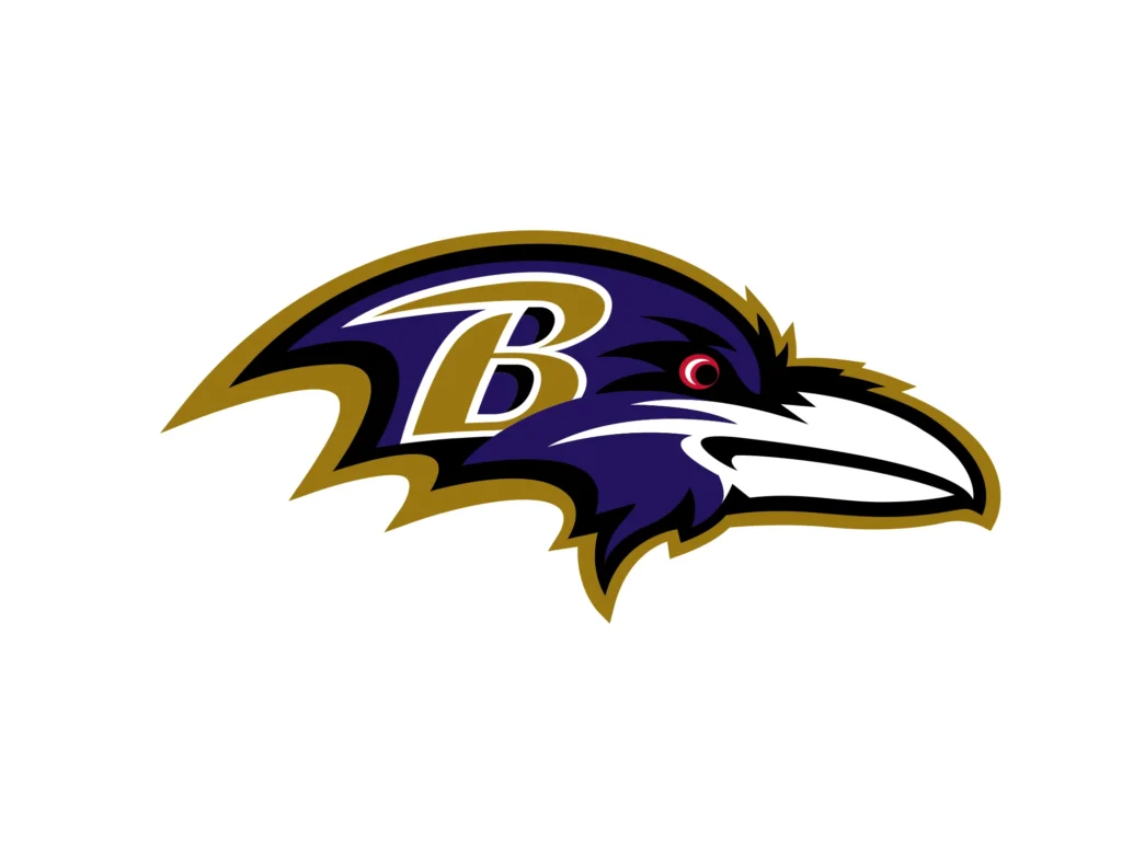
The NFL’s Baltimore Ravens pair deep purple with gold to project power and authority on the football field.
The name “Ravens” itself evokes darkness and mystery, and the purple color reinforces that identity perfectly. It’s one of the strongest color-to-name matches in professional sports.
What These Brands Have in Common
Notice a pattern? Every company on this list uses purple to signal something beyond the ordinary. Whether it’s luxury chocolate, overnight delivery, or science fiction programming, purple elevates the perception of the product before a single word is read.
Purple isn’t the safe choice. and research shows that 85% of consumers cite color as a primary reason for choosing one brand over another. That’s exactly why the brands bold enough to commit to it tend to stand out so memorably.
And that boldness is becoming even more relevant today – if you look at the logo design trends shaping 2026, the direction is clearly toward more expressive, high-contrast color choices rather than the safe, muted palettes that dominated the last decade.
If you’re building or refreshing a brand, don’t overlook the power this color carries.
What’s your favorite purple brand logo? There may be more hiding in plain sight than you’d expect.