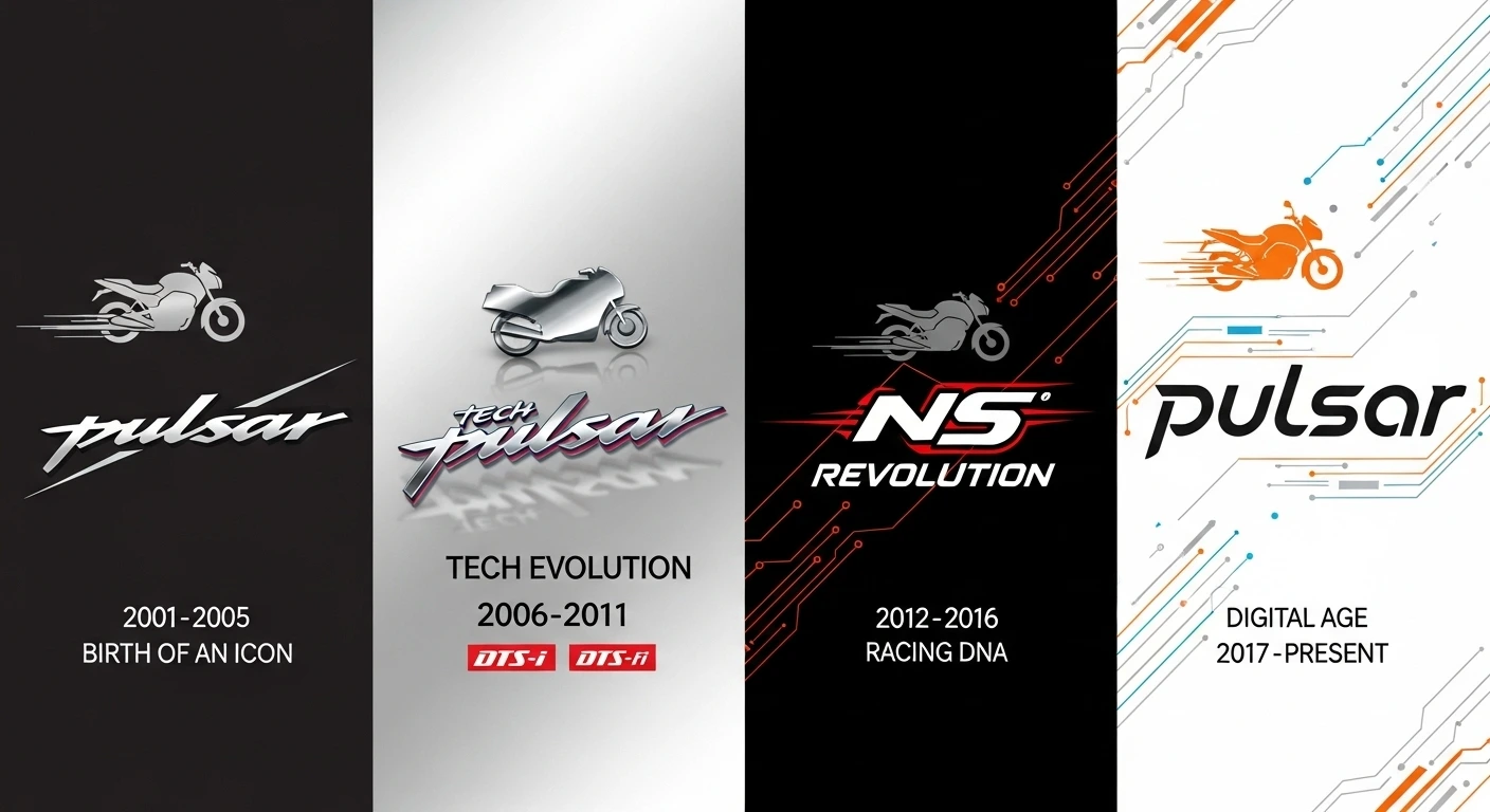
The Bajaj Pulsar logo is one of the most famous motorcycle symbols in India and beyond. It represents not just a bike but an important part of Indian motorcycle culture.
The brand started small but grew to shape the Indian bike market. Its logo changed over time, reflecting the brand’s journey and technological growth.
The Birth of an Icon (2001-2005)

When Bajaj Auto launched the first Pulsar bikes in 2001, most Indian riders used fuel-efficient commuter bikes.
The original logo was simple but striking. It featured the word “Pulsar” in a bold, sharp font, with a long “P” that hinted at speed. The design had sharp edges and tilted to the right, showing the sporty and aggressive vibe of the brand.
Typically, the logo appeared in chrome on the bike’s body, giving it a premium look and setting it apart from regular commuter bikes. This design matched the launch of the original 150cc and 180cc models, which introduced riders to the idea of a “sports commuter.”
The Tech Evolution Period (2006-2011)

In 2006, Bajaj launched its DTS-i (Digital Twin Spark ignition) technology, leading to a new look for the Pulsar logo.
The new logo showcased a sleek font with a shiny metallic finish. The word “Pulsar” often came with technology tags like “DTS-i” and later “DTS-Fi” (Digital Twin Spark – Fuel Injection), highlighting the brand’s focus on innovation.
During this time, the logo appeared on larger models like the Pulsar 200 and 220F, boosting the brand’s reputation for performance.
The design became more three-dimensional, featuring gradients and shadows that gave it depth and a sophisticated feel.
The NS Revolution (2012-2016)

In 2012, the launch of the Pulsar 200NS brought another update to the logo. It became more modern and streamlined, reflecting the sporty style of the new bikes.
The font changed slightly to look more compact and powerful, with clean lines that suggested speed.
This era also introduced the tagline “Racing DNA,” showcasing the brand’s motorsport roots and performance strength. The logo often had red accents, symbolizing speed and passion, along with chrome or black colors.
The Digital Age Redesign (2017-Present)
The latest Pulsar logo reflects the brand’s move into the digital world and the release of new models with LED lights and digital screens.
This logo features a modern font with balanced shapes and gentle curves that show off a sleek, sporty style.
What’s cool is how the logo fits different uses. On websites and ads, it often has energetic designs like motion lines or circuit patterns that suggest speed and technology.
On the motorcycles, the logo blends into the overall design, sometimes appearing on the tank or body graphics instead of as a separate badge.
The Color Evolution
The colors of the Pulsar logo have changed a lot too. Early versions mainly used chrome and black, while newer ones feature bold colors tied to each model:
- Pulsar NS series: Orange and black for energy and excitement
- Pulsar RS series: Blue for style and tech
- Pulsar 150 series: Red for approachability and popularity
Symbol of Youth Culture
Most importantly, the Pulsar logo has become more than just a brand mark; it’s a symbol of youth culture and ambition in India.
For many young riders, showing off the Pulsar logo means being part of a community that values performance, style, and breaking the rules.
Conclusion
The Bajaj Pulsar logo tells a story of how an Indian motorcycle brand grew from a newcomer to a leader in the market.
Every version of the logo reflects its time while keeping the Pulsar’s unique identity that people recognize right away.
The evolution of Pulsar’s logo across multiple redesigns—from 2001 to today—is a testament to the value that goes into creating iconic branding.
Understanding why logos are expensive and the strategic design process behind them helps appreciate how brands like Bajaj invest in visual identities that resonate with audiences for decades.
As Bajaj introduces new models and technologies, we can expect the Pulsar logo to change again, blending tradition with fresh design.
For bike lovers and branding experts, the Pulsar logo is a great example of how a visual identity can illustrate a brand’s journey.
What’s your favorite Pulsar logo? Have you owned a Pulsar? Did the logo impact your choice? Share your thoughts in the comments!


Leave a Comment