Why Fonts Matter in Logo Design
Your logo is more than just a picture — it represents your business. One key part of your logo is the font.
Choosing the right font can feel tough because there are so many options. You might think about using safe choices like Arial or Times New Roman, but these won’t help you stand out.
Instead, pick a font that shows off your brand’s personality, tells your story, and connects with your audience.
In this article, we’ll help you learn how to choose the perfect font for your logo. We’ll cover:
- Understanding your brand personality
- Exploring different font types
- Combining fonts the right way
- Top font suggestions for logos
Let’s get started!
🔍 Step 1: Define Your Brand Personality
Before you start looking at font options, take a moment to think about your brand’s personality. Ask yourself:
- Is my brand modern and simple?
- Is it traditional and classic?
- Or is it bold and adventurous?
Make sure your font matches your brand’s voice and feel. If you run a luxury fashion brand, a fun comic font probably won’t work. Similarly, a tech startup focused on innovation should avoid fancy script fonts.
💡 Tip:
Think of your font as your brand’s tone of voice. Would your brand sound formal and polished, or casual and friendly?
🧱 Step 2: Understand Different Font Families
Fonts come in different types, each with its own look and feel. Here’s a quick guide to the main font groups to consider for your logo:
1. Serif Fonts – Classic & Elegant
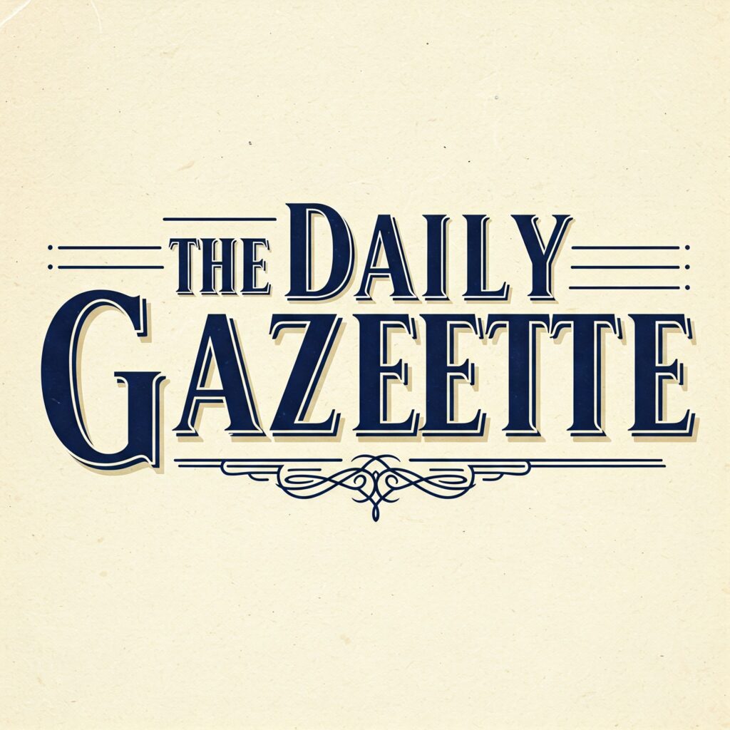
Serif fonts have small lines at the end of letters, making them look traditional and sophisticated. They often convey professionalism and trust.
Best For: Law firms, newspapers, academic institutions, luxury brands.
Popular Examples: Times New Roman, Georgia, Garamond
2. Slab Serif Fonts – Bold & Strong
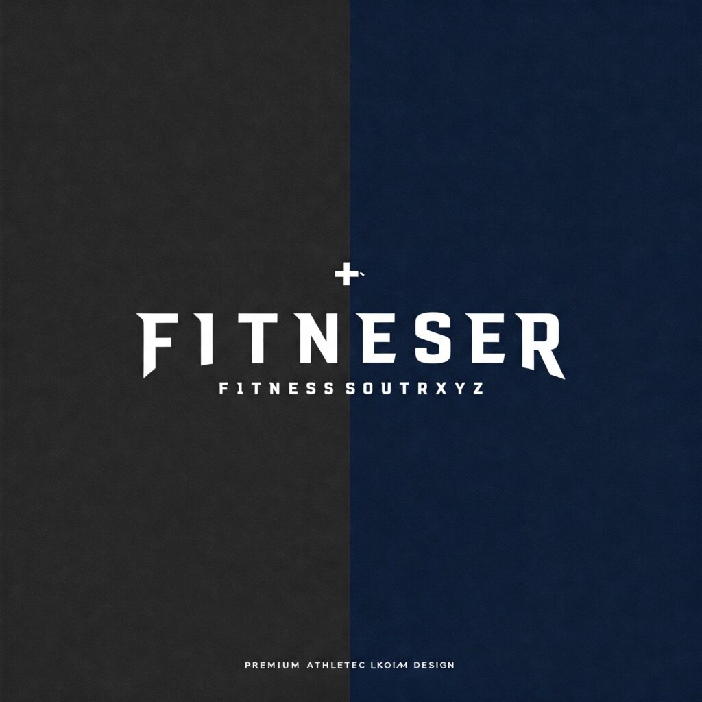
Slab serif fonts have thick, block-like serifs, making them appear bolder and more impactful. They’re great for creating high visibility and a sense of strength.
Best For: Brands looking to convey confidence, stability, and clarity.
Popular Examples: Rockwell, Courier Bold, Roboto Slab
Image Prompt: A fitness brand logo using a slab serif font like Rockwell.
3. Script Fonts – Elegant & Personal
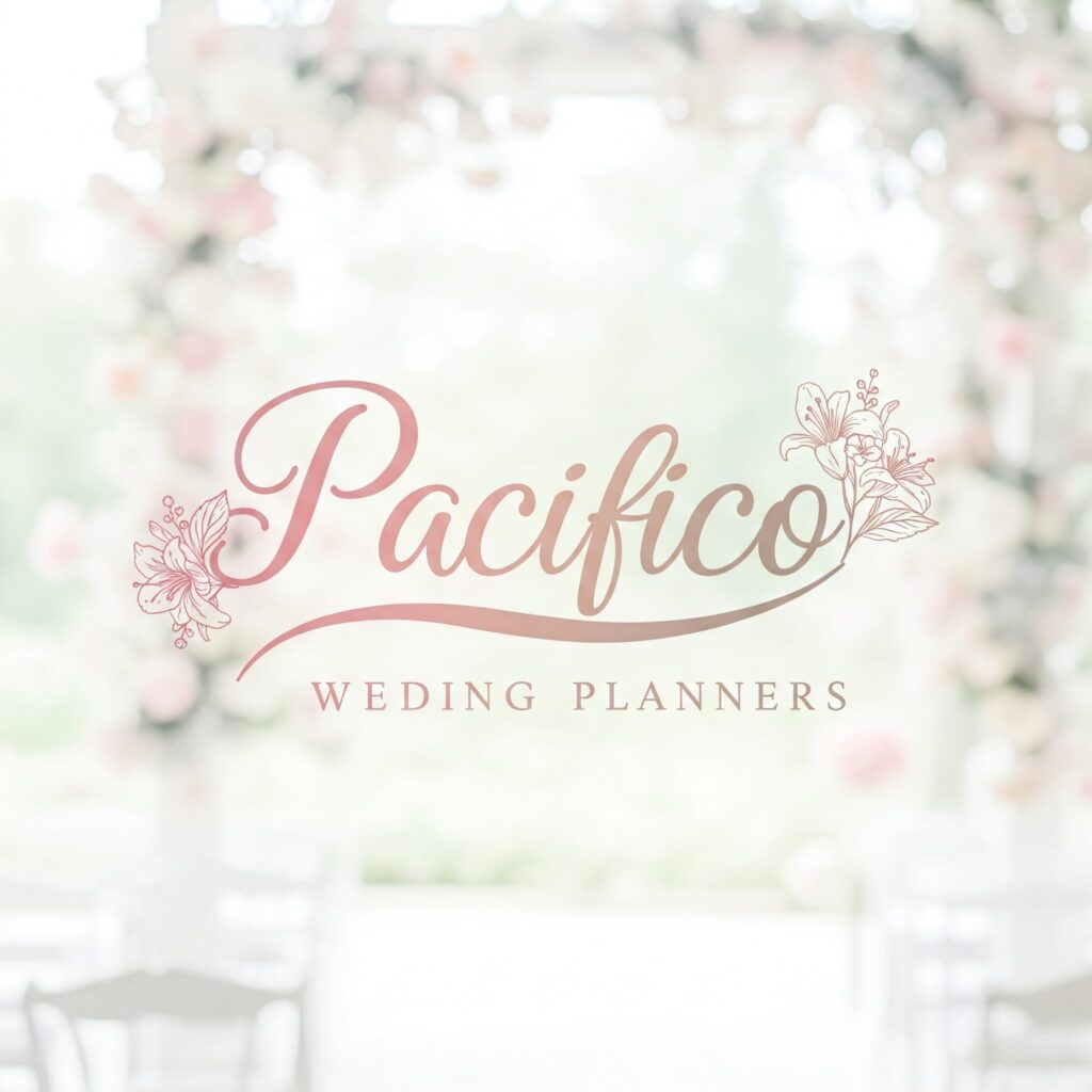
Script fonts mimic handwriting or calligraphy. They can range from elegant and formal (like wedding invitations) to casual and playful (like a scribbled note).
Best For: Wedding planners, lifestyle blogs, boutique stores, beauty brands.
Popular Examples: Brush Script, Pacifico, Great Vibes
4. Sans Serif Fonts – Modern & Clean

Sans serif fonts lack the decorative serifs found in serif fonts, giving them a clean, contemporary look. They’re versatile and work well across digital platforms.
Best For: Tech companies, startups, health and wellness brands.
Popular Examples: Helvetica, Arial, Proxima Nova
5. Display Fonts – Unique & Eye-Catching
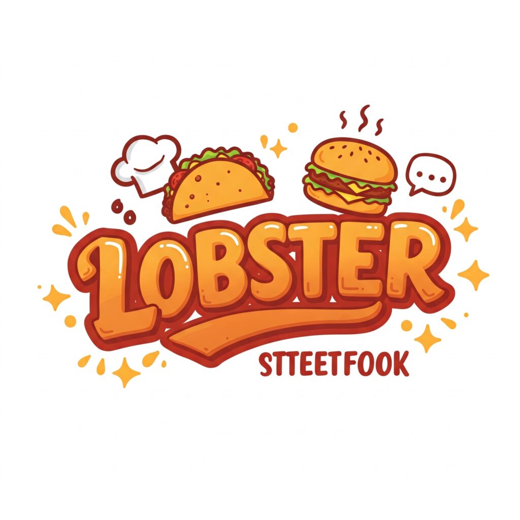
Display fonts are highly stylized and designed to grab attention. They’re not meant for long blocks of text but work well for headlines or logo names.
Best For: Creative industries, entertainment, food & beverage, edgy fashion brands.
Popular Examples: Bebas Neue, Impact, Lobster
⚖️ Step 3: Can You Combine Fonts in a Logo?
You can mix fonts, but do it carefully. Mixing can make your logo more interesting and guide the viewer’s eye. Here are some rules to keep in mind:
However, here are a few key rules to follow:
- Limit Yourself to 2–3 Fonts Maximum Too many fonts can make your logo look cluttered and unprofessional.
- Ensure Visual Harmony Choose fonts that complement each other rather than compete. For instance, pair a bold sans serif with a delicate script.
- Use Variants of the Same Font Instead of combining multiple typefaces, try using different weights (bold, italic, light), cases (uppercase vs lowercase), or styles within the same font family.
🌟 Step 4: Explore Some Trendy Logo Fonts
Ready to get inspired? Here are three popular logo fonts that are currently trending in the design world:
1. Proxima Nova
Personality: Modern, geometric, clean
Vibe: Futuristic yet balanced
Used By: Spotify, Twitter, Adobe
Why It Works: Proxima Nova blends classic geometry with modern proportions, making it incredibly versatile. It’s a favorite among tech and social media brands due to its sleek appearance and legibility across devices.
2. Bebas Neue
Personality: Bold, minimalist, utilitarian
Vibe: Industrial, ambitious, confident
Used By: Fashion labels, fitness brands, editorial designs
Why It Works: Bebas Neue is a condensed sans-serif font that makes a strong visual impact. Its all-caps style adds intensity without being overly flashy.
3. Modesta
Personality: Vintage, whimsical, artistic
Vibe: Circus-inspired, nostalgic, creative
Used By: Lifestyle brands, vintage shops, event planners
Why It Works: Modesta is a hand-painted, brush-style font that brings charm and character to any logo. It’s perfect for brands that want to evoke nostalgia or playfulness.
🛠️ Step 5: Tools & Resources for Font Selection
Before we dive into the basic tools, if you’re looking for advanced typography solutions specifically designed for logo design, check out our guide on Typography Plugins For Logo Design for professional-grade options.
🔍 Font Finders & Libraries
🖋️ Font Pairing Tools
🎯 Logo Builders
💡 Want to take your logo creation to the next level? Our complete tutorial on How to Create Stunning Logos with AI walks you through the entire process of combining the right fonts with AI-powered design tools for professional results.
🤝 When to Hire a Professional Designer
If you’ve tried various fonts and still don’t feel like you’ve found “the one,” it might be time to bring in a professional designer. Custom typography can elevate your brand and ensure your logo stands out in a crowded market.
A skilled designer will:
- Understand your brand deeply
- Create custom lettering or tweak existing fonts
- Ensure consistency across all branding materials
- Help you avoid common typographic mistakes
✅ Final Checklist: Before Finalizing Your Logo Font
Here’s a quick checklist to make sure your font choice is spot-on:
- ✔️ Matches your brand personality
- ✔️ Is legible at small sizes
- ✔️ Looks good in both color and black & white
- ✔️ Scales well across different mediums (print, web, mobile)
- ✔️ Doesn’t infringe on licensing rights
- ✔️ Stands the test of time (not too trendy)
- ✔️ Meets accessibility standards
Your logo font should be readable for everyone, including people with visual impairments. The Web Content Accessibility Guidelines (WCAG) provide standards for contrast ratios and legibility.
While logos have some flexibility, ensuring your font choice works well in various contexts helps create an inclusive brand identity.
📚 Conclusion: Finding Typographic Love
Choosing the right font for your logo is like finding the perfect partner — it takes time and a good understanding of your brand. Don’t rush. Take your time to explore and experiment, and stay true to your brand’s values.
Your logo often gives people their first impression of your business. Make sure it shines with style and personality.
🔑 Key Takeaways
- Your font should reflect your brand personality.
- Understand the emotional tone of different font families.
- Limit yourself to 2–3 fonts max in a logo.
- Use font pairing wisely for visual harmony.
- Consider hiring a professional for custom typography.
- Always test your font across different platforms and sizes.
Not sure which font fits your brand best? Try free design tools like Canva or Figma, or get help from a professional designer to create a logo that truly reflects who you are.
Share this guide with other entrepreneurs and designers looking for their perfect font match! 😊

