Physical Address
304 North Cardinal St.
Dorchester Center, MA 02124
Physical Address
304 North Cardinal St.
Dorchester Center, MA 02124

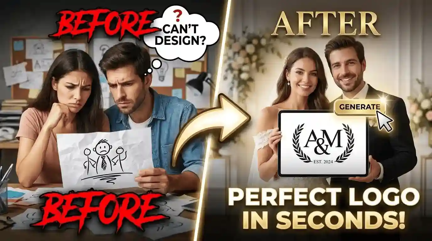
Planning a wedding means dozens of small design decisions, and most couples have never made one before. Picking a logo – something that will end up on invitations, signage, and favors – can feel like the hardest one, especially with no design background.
That’s where a bit of structure helps. You don’t need to be a designer to end up with a wedding logo you actually love. You just need a clear way to think through the choices.
Here’s a simple framework for approaching your wedding logo, broken into the decisions that matter most.
Most wedding logos are built around the couple’s names or initials, often joined by an ampersand or a small symbol. This is the easiest starting point because it’s personal by default – no extra concept needed.
Some couples use full first names, others just initials. Shorter is usually easier to read at small sizes, like on a wax seal or napkin.
Adding the wedding date is optional, but it turns the logo into more of a keepsake. A small numeric date under the names works well and doesn’t compete for attention.
If your wedding has a specific season or location that matters to you, this is also a place to hint at it – a year alone can carry that meaning.
Fonts and layouts carry tone. A script font paired with a thin line reads romantic and classic. A bold sans-serif in a circle reads modern and clean. Hand-lettering feels casual and warm.
The mistake to avoid is picking a style because it’s popular right now. Match it to your actual wedding – the venue, the season, the vibe you and your partner already have.
If you want a sense of where design tastes are actually heading, it’s worth seeing why “ugly” AI logos are winning in 2026 before you assume polished and trendy is always the safer choice.
A single icon – a heart, a leaf, two rings, a monogram frame – can round out a logo without cluttering it. The key word is “one.” Wedding logos that try to include a flower, a heart, and a filigree border tend to look busy at small sizes.
If you’re not sure whether a symbol fits, leave it out. Names and a date alone are always a safe, elegant choice.
A logo that looks great as a large image can fall apart shrunk down to a stamp or a favor tag. Before finalizing anything, check how it looks at the smallest size you’ll actually use it – usually a wax seal or a place card.
If details disappear or letters blur together at that size, simplify. Fewer elements almost always hold up better than more.
Once you land on a design, use the same version across every touchpoint – invitations, the wedding website, table numbers, and favors. Consistency is what makes a logo feel intentional rather than like separate design choices for each item.
Save it in a couple of formats (a transparent background version is especially useful) so it’s ready for print and digital use without extra editing later. If you’re weighing whether a budget-friendly maker can produce those formats well, it’s worth reading a review like Looka Review 2026 before you commit to one.
None of this requires design training. It just requires making a handful of decisions in order, and being willing to simplify when something feels crowded.
If you’d rather skip building a logo from scratch, tools like logoai.com can generate wedding logo options based on your names and style preferences, which is a fast way to get a starting point you can then adjust.
It’s not a replacement for the choices above – you’ll still want to apply the same thinking about style, symbols, and legibility to whatever it produces.
Whether you design it yourself or start from a generated option, the goal is the same: something simple enough to hold up on a napkin, and personal enough to mean something years from now.