Most people answer this wrong. They say “recognition” or “consistency” — which are outcomes, not goals. The primary goal of branding in graphic design is to control how your audience perceives you. The logo, the color palette, the font choices — all of that is just the toolkit.
Your brand will form a perception in people’s minds whether you design it deliberately or not. The only real question is whether you’re the one shaping it.
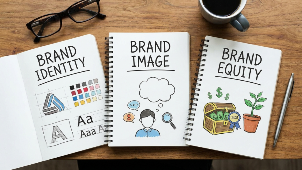
Differences Between Brand Identity, Image, and Equity
Most branding articles use these three terms interchangeably. They shouldn’t.
Brand identity is what you intentionally put out — the logo, colors, typography, tone of voice. It lives in your design files and brand documents.
Brand image is what people actually think of you. It forms in their heads, not in Figma. You can’t directly control it, only influence it through consistent design decisions.
Brand equity is the financial and reputational value that builds up when identity and image reliably match over time.
The gap between identity and image is a design problem. If you’re projecting “premium” but customers feel “cold and unapproachable,” something in the visual communication is off — probably the typography, the color temperature, or the spacing choices. That’s not a marketing issue. That’s a graphic design issue.
Apple is the obvious example, but it holds up: its identity (clean, minimal, precise) and its image (innovative, trustworthy, premium) are nearly identical in most people’s minds.
That alignment doesn’t happen by accident. It happens because every design decision points in the same direction, across every product, every ad, every packaging detail.
Color, Shape, and Typography Are Making Decisions Before Your Customer Does
Here’s what most branding articles mention but never actually explain.
Color triggers emotional responses before the brain consciously processes them. Red creates urgency and energy — which is why Coca-Cola, YouTube, and Netflix all use it. Blue signals trust and calm – PayPal, LinkedIn, Samsung.
Green reads as natural, healthy, or financially sound (Whole Foods, Robinhood). These aren’t random cultural associations. They’re consistent psychological responses, and they work on your audience whether you account for them or not.
Purple, consistently signals luxury and creativity – from Cadbury to Hallmark, as famous companies with purple logos illustrate clearly.
Shape psychology works the same way. Circles feel inclusive and community-oriented – think Pepsi, Firefox, the Olympic rings. Triangles suggest precision or power. Organic, irregular shapes feel handcrafted and natural.
A wellness brand built around sharp geometric angles will feel subtly off even if a customer can’t explain why.
Typefaces carry personality too. Serif fonts communicate authority and heritage. Sans-serif fonts feel modern and functional. Script fonts feel warm and personal but don’t scale well to small sizes or complex applications.
A law firm using a rounded, playful sans-serif isn’t just an aesthetic mismatch — it’s a trust signal going in the wrong direction.
The graphic designer’s job isn’t to make things look good in isolation. It’s to make sure the visuals and the brand message are saying exactly the same thing.
Strategy Has to Come Before Any Design Decision
This is where most branding projects go wrong from day one.
Graphic design is not the first step. Before a single color is picked or a moodboard is built, a brand needs answers to some basic questions: Who is the audience, specifically? What does this brand promise that competitors don’t? How should someone feel after interacting with it?
The process runs in this order: audience research, then positioning, then messaging, and only then visual design.
Reversing that sequence — which most clients push for, and too many designers allow — produces work that looks polished but communicates nothing. It’s technically well-made and completely hollow. Knowing what to look for when choosing graphic design services that deliver strategic value – not just polished visuals — matters as much as the work itself.
A brand brief before any project starts prevents this. Six to eight questions: What problem does this solve? Who is it for, specifically? What three words should describe how customers feel after engaging with the brand?
Who are the main competitors, and how should this brand look different from them? The answers to those questions should drive every visual decision that follows — color, type, shape, layout, all of it.
The Style Guide is What Makes It Last
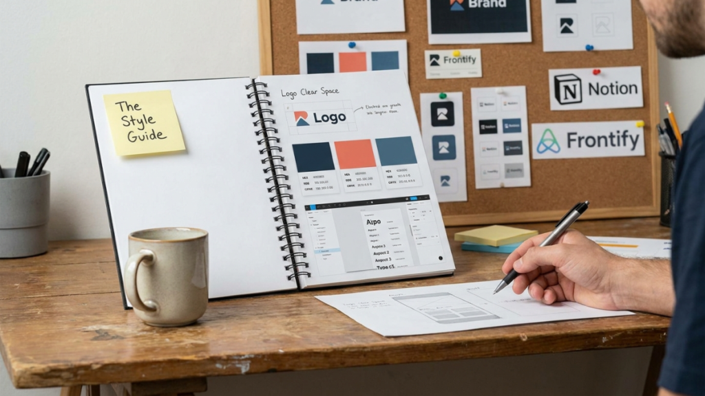
Even a well-designed brand falls apart without documentation.
A brand style guide captures the full system: logo usage rules (minimum size, clear space, what not to do with it), exact color codes in hex, RGB, and CMYK, typography specs, and approved usage examples. Tools like Figma, Frontify, or even a well-structured Notion document all work.
Without one, inconsistency creeps in gradually. Different team members use slightly different shades of the brand blue. A vendor resizes the logo and distorts it. A social post goes out in the wrong font. None of it is catastrophic on its own – but it compounds over time. The visual cohesion that branding was supposed to build starts to fragment.
The style guide turns a branding project into a branding system. That’s the real deliverable.
The primary goal of branding in graphic design is to build a specific perception — and then protect it, consistently, across every touchpoint. The logo is the entry point. The strategy behind it, the psychological precision of the visuals, and the documentation that holds it together are what actually make it work.
Start with strategy. Build visuals that back it up. Document it so it lasts.
Frequently Asked Questions About Graphic Design Branding
What is the Difference Between a Logo and a Brand?
A logo is just one visual symbol — like a mark or icon — used to identify something quickly. A brand is much bigger. It includes the full experience, the feelings people have, the reputation, and the plan behind a company. The logo is just one small part of the whole brand.
What are the Primary Goals of Branding in Graphic Design?
The main goals of branding in graphic design are to be recognized right away, build trust with the audience, show what the company stands for, and create an emotional connection. Good design turns a company’s purpose into something you can see — and that helps keep customers coming back and builds lasting value over time.
How Does Graphic Design Impact Brand Identity?
Graphic design is what brings a brand’s look to life. Designers use color, fonts, and shapes in smart ways to build a clear, consistent look that shapes how people see the brand. It keeps everything looking the same across all platforms, and shows the brand’s personality and message every time.
Why is Visual Communication Essential For a New Brand?
Visual communication matters a lot for new brands because the human brain takes in pictures much faster than words. Strong design grabs attention right away, makes a lasting first impression, and explains who a company is and what it offers – before a customer reads even one word.