Physical Address
304 North Cardinal St.
Dorchester Center, MA 02124
Physical Address
304 North Cardinal St.
Dorchester Center, MA 02124

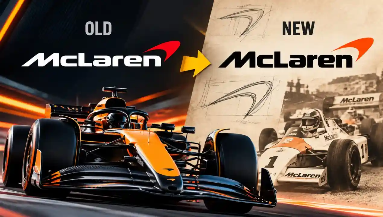
McLaren has changed its visual identity. But the interesting part isn’t simply that the logo is new. It’s where the design came from – and how much of it was already there.
McLaren’s rebrand didn’t start with a blank canvas. It started with history.
The design team went back through decades of McLaren’s racing archives — liveries, paddock passes, championship posters — and found something consistent across all of them. A visual language that had been used intuitively, but never formally codified.
That became the foundation. The new identity isn’t a departure. It’s an excavation.
This approach is rare. Most rebrands try to signal change. McLaren’s tried to signal continuity — just stated more precisely than before.
Look at the “C” in McLaren’s new wordmark carefully.
The aperture — the open gap in the letter — has been subtly widened. It’s a change measured in fractions of a millimeter at normal scale. But at large sizes, on a race car or a billboard, it shifts how the whole word feels.
The wider aperture makes the “C” feel faster. More open. Less mechanical.
It also echoes the curvature in the Speedmark – McLaren’s iconic symbol – creating a visual rhyme between the letterform and the logo mark. That connection didn’t exist before. Now it does.
This is the kind of decision that gets no announcement and takes six months to agree on.
Off-the-shelf fonts don’t carry brand IP. Any competitor could license the same typeface tomorrow.
McLaren resolved this by commissioning a proprietary typeface — developed specifically for the brand, owned exclusively by them. The typeface is called McLaren.
It draws from motorsport tradition: the proportions are confident, not decorative. Letterforms are optimised for legibility at speed — on screens, in broadcast graphics, on cars doing 200 mph past a grandstand.
One design principle guided the entire typeface: every letterform had to look right whether it was on a business card or the side of a Formula 1 car. Most corporate typefaces fail at one end of that scale. This one was engineered for both.
For brands that can’t commission a full proprietary typeface, AI logo customization tools can help differentiate letterforms at a fraction of the cost — though IP ownership of the output depends on the platform.
Building a proprietary typeface is a significant investment. For McLaren, it’s also a moat. Nobody else can use this font without permission. The wordmark is now, legally and visually, untouchable.
The Speedmark — McLaren’s stylised swoosh mark — survived the rebrand. But it changed.
The previous version had a slight orange tint embedded in certain applications. The new version is cleaner, more monochromatic in its base form. It’s been redrawn at a precision that makes it scale flawlessly from a watch face to a factory wall.
It hasn’t been retired or simplified into irrelevance. If anything, it’s been given more structural importance in the system. When the wordmark doesn’t appear, the Speedmark carries the identity alone. For that to work, it had to be bulletproof.
What McLaren effectively did was separate the Speedmark’s identity from any single colour. It now works in black, white, or papaya — without losing its character in any of them.
McLaren’s heritage colour is Papaya Orange — one of the most recognisable colours in motorsport, dating back to the 1960s when Bruce McLaren raced in the shade.
The new identity doesn’t eliminate papaya. But it uses it more sparingly.
The primary palette has shifted toward darker backgrounds, deeper greys, and high-contrast applications. Papaya now functions as an accent — used to highlight, not to saturate.
The reasoning is partly functional. McLaren has expanded beyond racing into road cars, technology, and lifestyle categories. A brand that is 80% orange works at a racetrack. It doesn’t work across a product line that includes carbon-fibre road cars starting at £150,000.
Darker executions also photograph better, translate better across digital screens, and feel more premium in high-end retail contexts.
The colour hasn’t gone. It’s been made more valuable by being used less.
McLaren’s rebrand offers three lessons that apply well beyond motorsport.
First: proprietary typography is a serious competitive advantage. Brands that own their typefaces own a layer of identity that cannot be copied without permission. The investment pays back over decades.
Second: restraint is harder than renovation. It would have been easier to launch a radically different mark. Choosing to refine — and defending every microscopic decision — requires more confidence in the original thinking.
Third: colour has equity, and equity has limits. Papaya orange is valuable because of what McLaren built with it. Using it everywhere would dilute that value. Protecting it means using it deliberately.
The McLaren rebrand will not make headlines the way a complete overhaul would. That’s the point. If you’re tracking logo design trends in 2026, restraint and precision are emerging as the dominant creative signals — not reinvention. In ten years, this rebrand will look like the brand was always this precise. That’s the real ambition of the project.